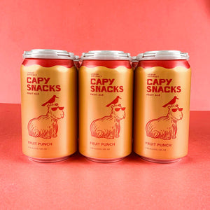


Some of our beer names take a long time to decide on. Some are quick suggestions and unanimous approval. Some take some deliberation on the meaning of the words and how they’ll get mentally tied back to the presentation of the beer – to consumers, to retailers, and to distributors. Essentially, Scotty Hunter, Bret Kollmann-Baker, and I have been the start and end of that process so far. We sometimes elicit feedback from the staff and our spouses for variety or confirmation of opinions. We’ve happily started getting great suggestions from the brewing team for the upcoming brews, too! (Joshua Elliott named our upcoming plum beer.)

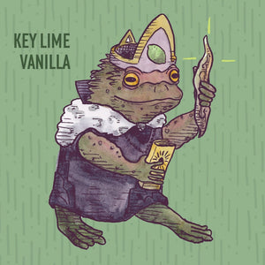
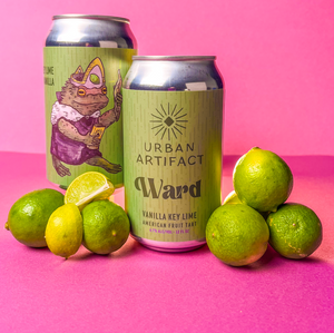
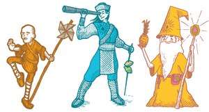
Finn was our first brand and was a beer that just happened. The beer itself was designed and configured by Bret and Scotty before we even assembled together as a full team. While they didn’t have a name for it, our team started calling it Finn very early in the process. It’s really the only one that we had to go hunting to find it’s “Urban Artifact” connection – the subsequent beers were a more thoughtful. We went through a brief branding exercise using Mark Twain’s Huck Finn character as the basis, but none of the imagery, meaning, or timeline seemed to fit with our intentions for the beer. The incredible story of Radbod the legendary Frisian King and his magical war helmet named Finn is perfect, though. It’s a great anecdote, connects to our aesthetic, and really provided the first instance of the “character drawings” that now are a staple of our perennial beers.
The development of the branding for Finn created a workflow that I still use as we develop new beers. Finn was a struggle, but it was one I went through happily. It turns out that figuring out how to represent a flavor through images is fun! I went through a couple dozens of different iterations, trying to draw the helmet itself – without really landing on a good visual. I wanted to stay away from the most stereotypical Viking helmet, but still clearly needed to reference that graphically. Eventually, I tried a sketch of Radbod, himself. He got redrawn a few times to adjust his posture and the pen line weights I was using. The end result was that we saw a character that represented the name, and tried to embody the concept of the beer. This became the standard for the other perennial beers in some form.
After tasting the initial test batch and talking (at great length) about our tap handles (this was the first one, remember), Finn was YELLOW. I believe that decision was just mine and no one even questioned it. Occasionally, I’ll bounce the colors off of Scotty and Bret, “Hey, I think Flash Lamp is a darker blue”, but usually they just see them once it’s done.
The best part of the entire process was our eventual decision to put Finn into cans. Seeing the artwork printed on thousands of cans for the first time was both overwhelming and humbling. I’m used to doing one-off drawings, unique building designs, and paintings. Mass-produced product design was never something I intended on getting into, but it’s a thrill to watch happen. It’s incredibly awesome to load up Instagram and see a photo of my work or to walk into a local store or bar and see our products on their shelves.
Cheers,
Scott Hand
Chief of Organization